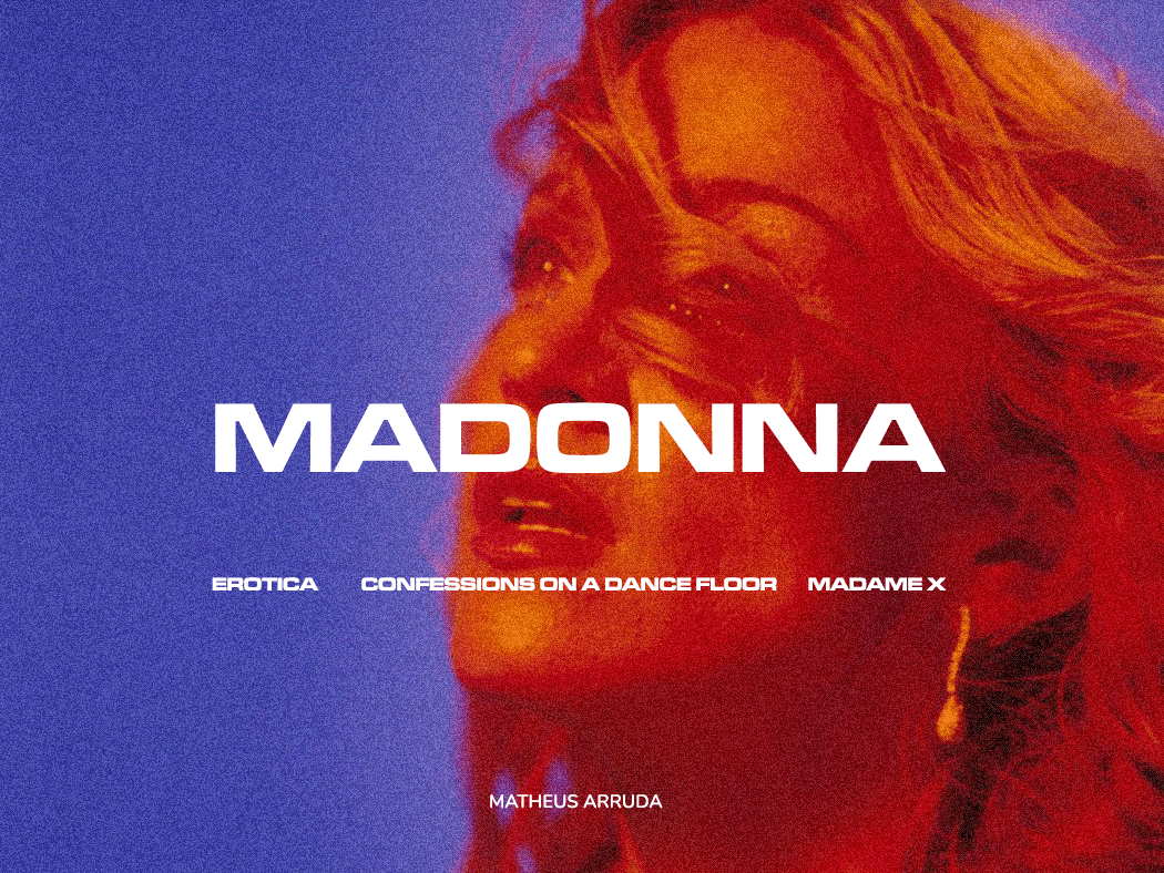
PT
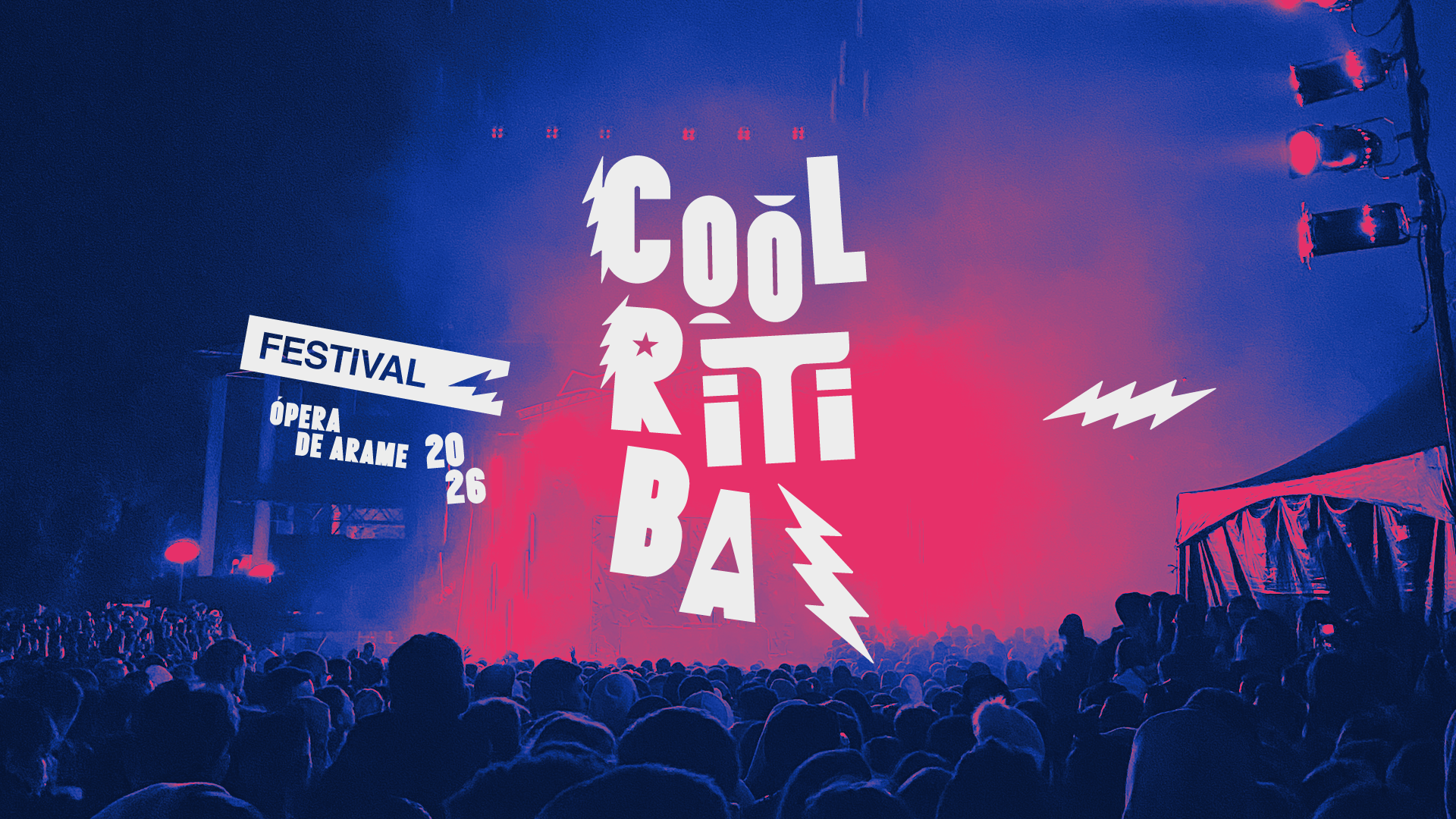
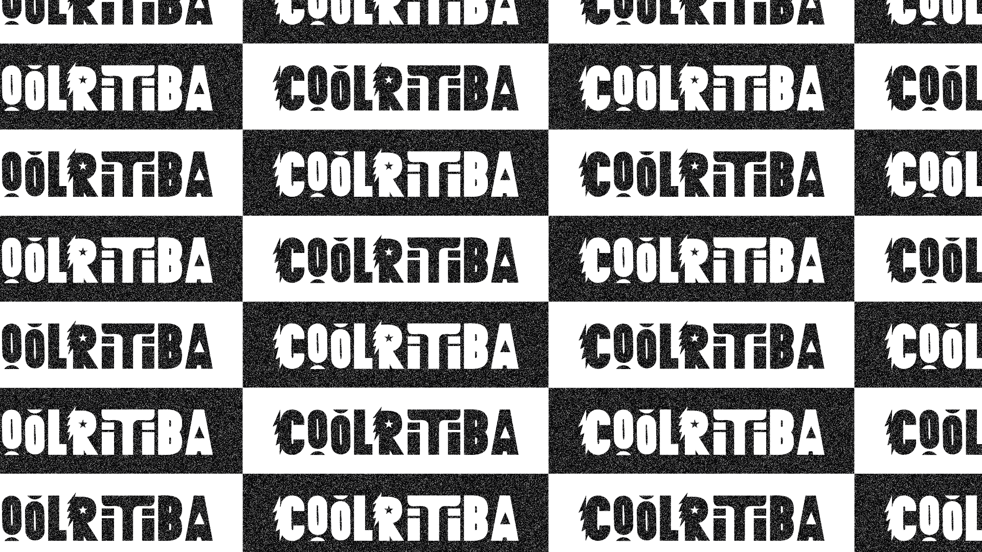
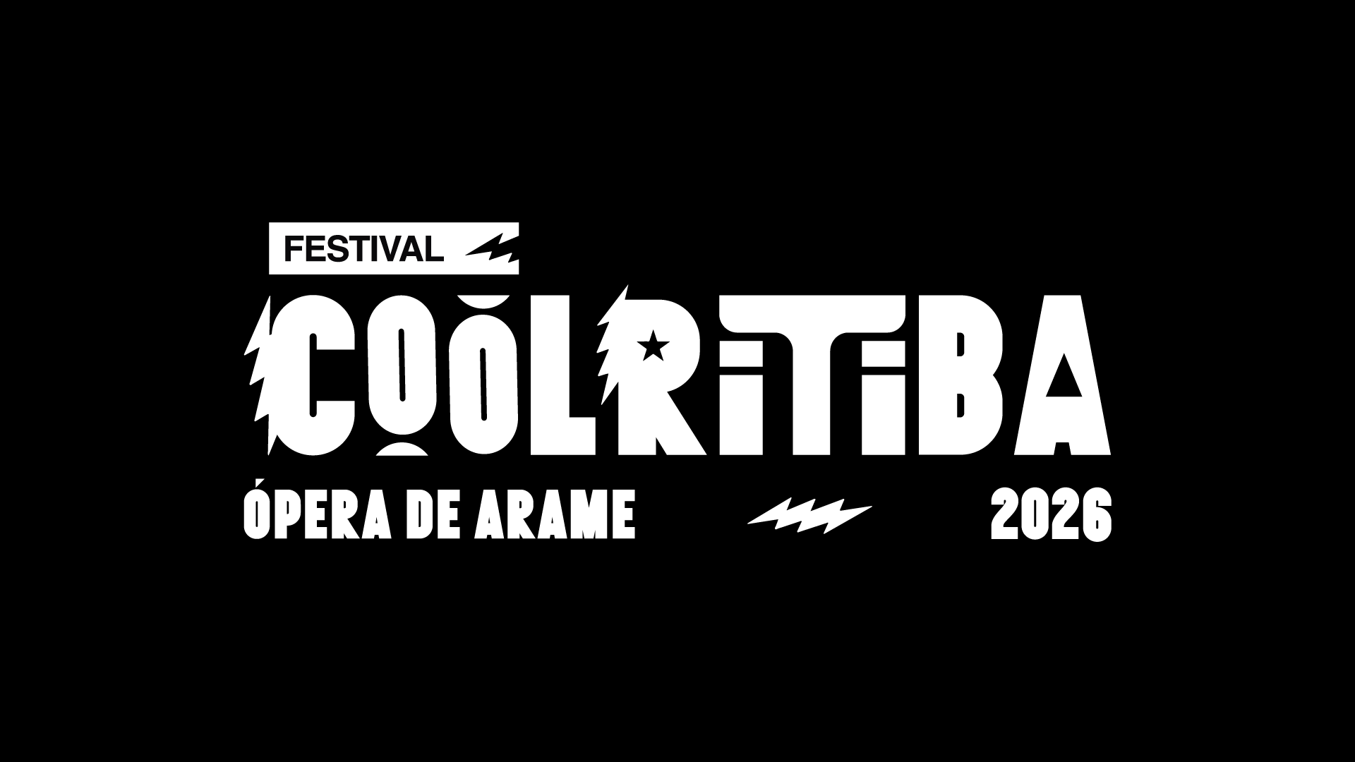
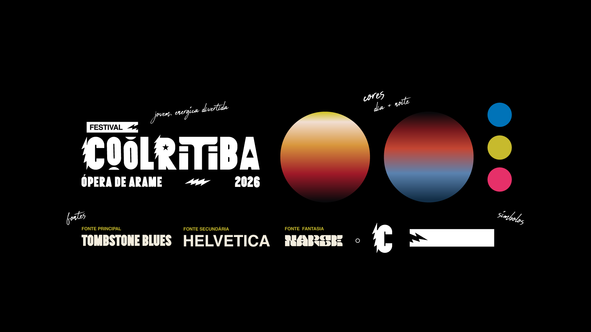
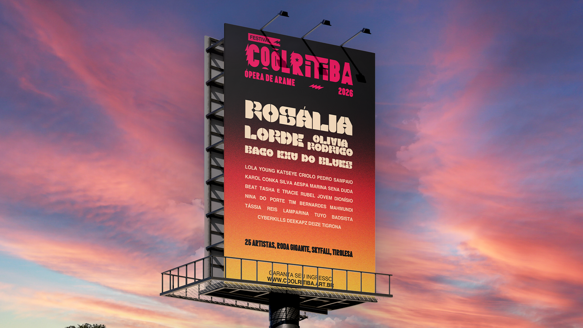
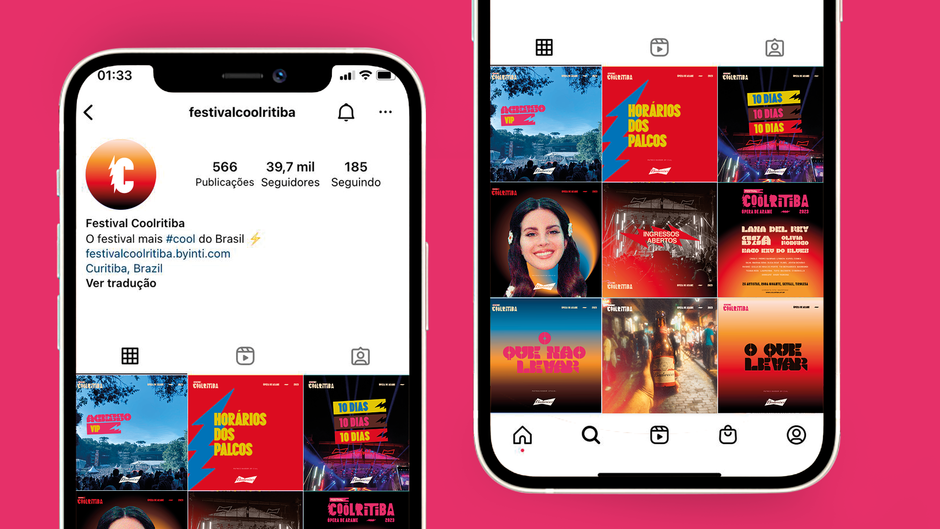
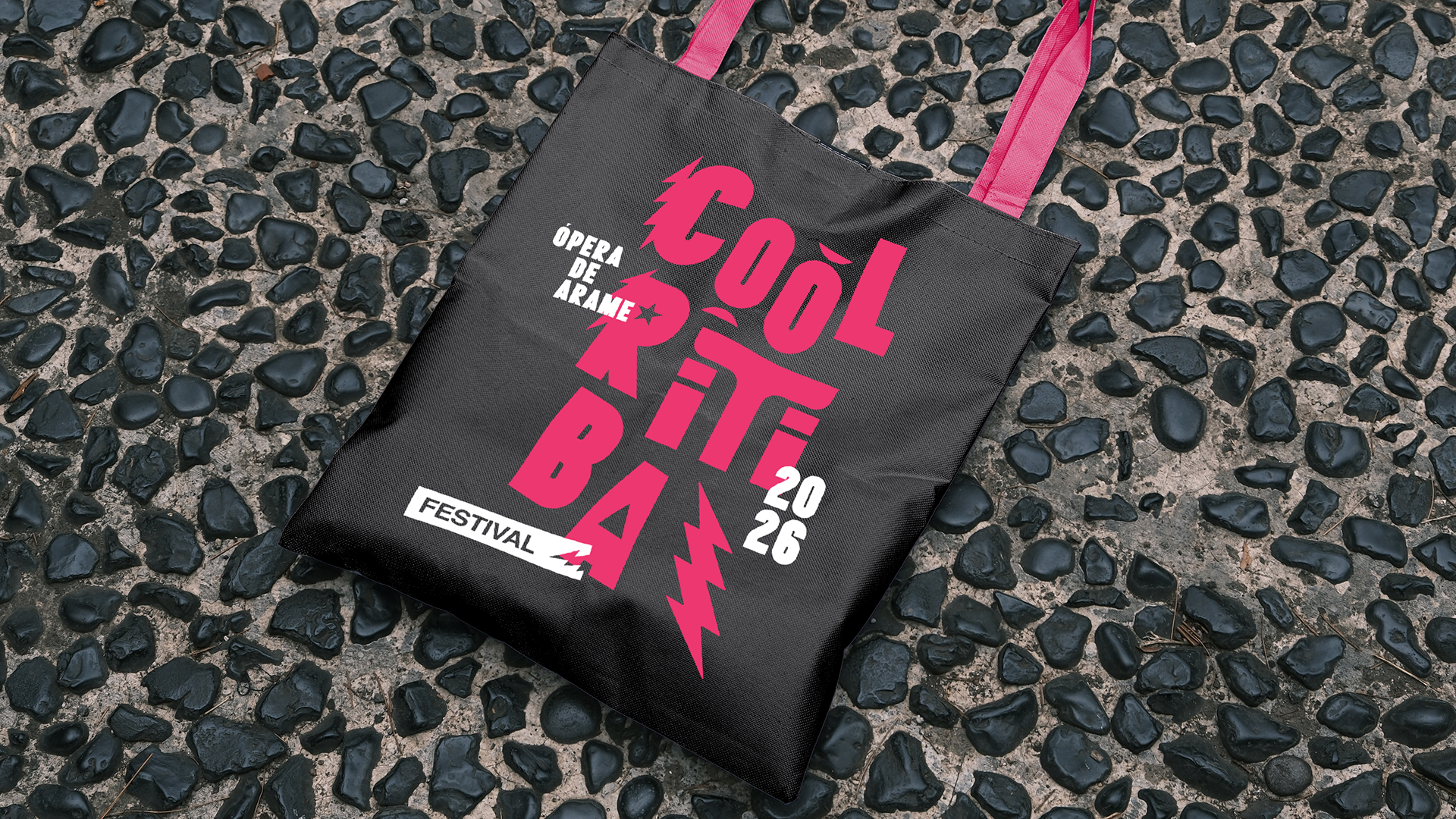
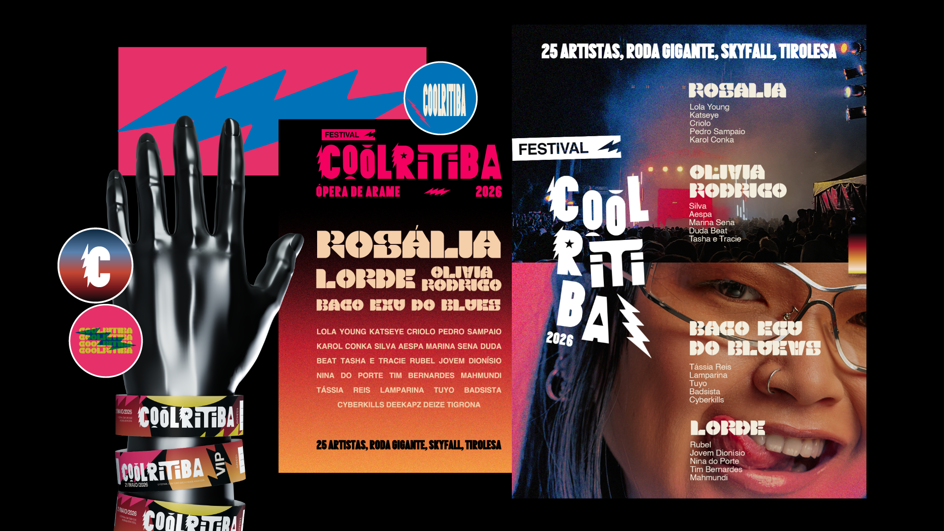
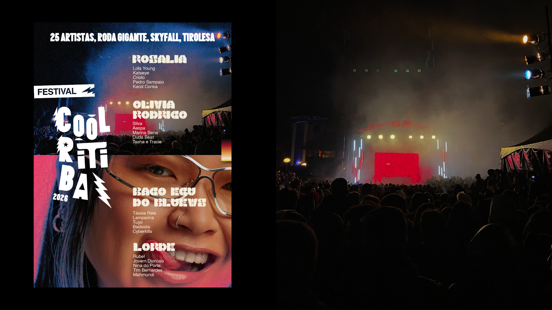
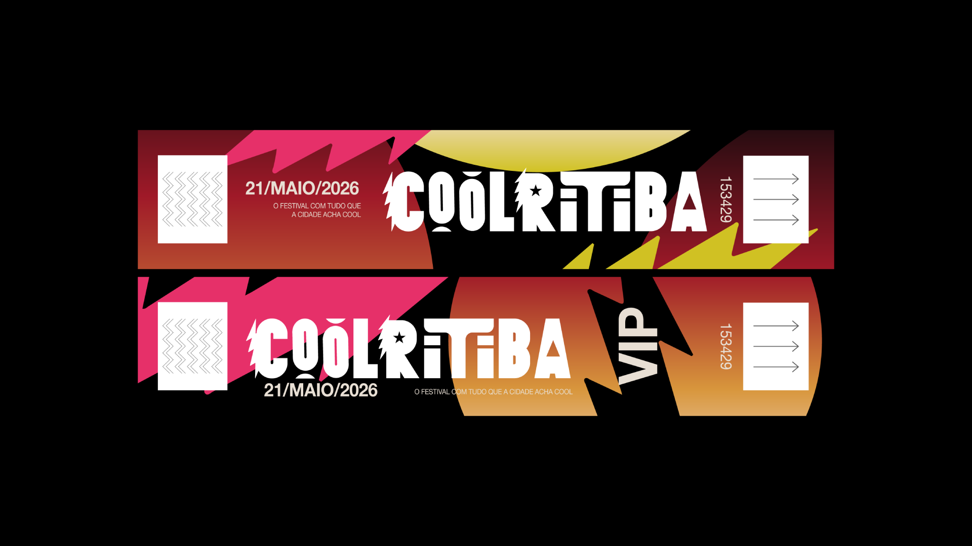
Projeto de Redesign de identidade visual de marca desenvolvido como estudo de peças. O intuito foi criar um logo que transmitisse energia, jovialidade e ao ser reduzido pudesse dar uma melhor leitura que o atual utilizado. O Logotipo sintetiza diferentes conceitos, o raio e o tipo "O" trazem a sensação de energia e movimento, o play "D" encontrado no "A" traz a música, principal atividade do festival, de uma forma discreta e divertida, o T faz alusão à árvore de Araucária, muito presente em Curitiba, cidade que reside o festival "Coolritiba". Aplicações em Outdoors, posters, papelaria e design para posts em redes sociais também foram pensados em comunicar e aumentar o universo de branding da marca.
EN
Brand visual identity redesign project developed as a study of pieces. The aim was to create a logo that conveyed energy and youthfulness and, when reduced in size, could be read more easily than the current one. The logo synthesizes different concepts: the lightning bolt and the letter “O” convey a sense of energy and movement, while the play button “D” found in the letter “A” discreetly and playfully references music, the festival's main activity. The letter ‘T’ alludes to the Araucaria tree, which is very common in Curitiba, the city where the “Coolritiba” festival is held. Applications on billboards, posters, stationery, and designs for social media posts were also designed to communicate and expand the branding universe.
PT
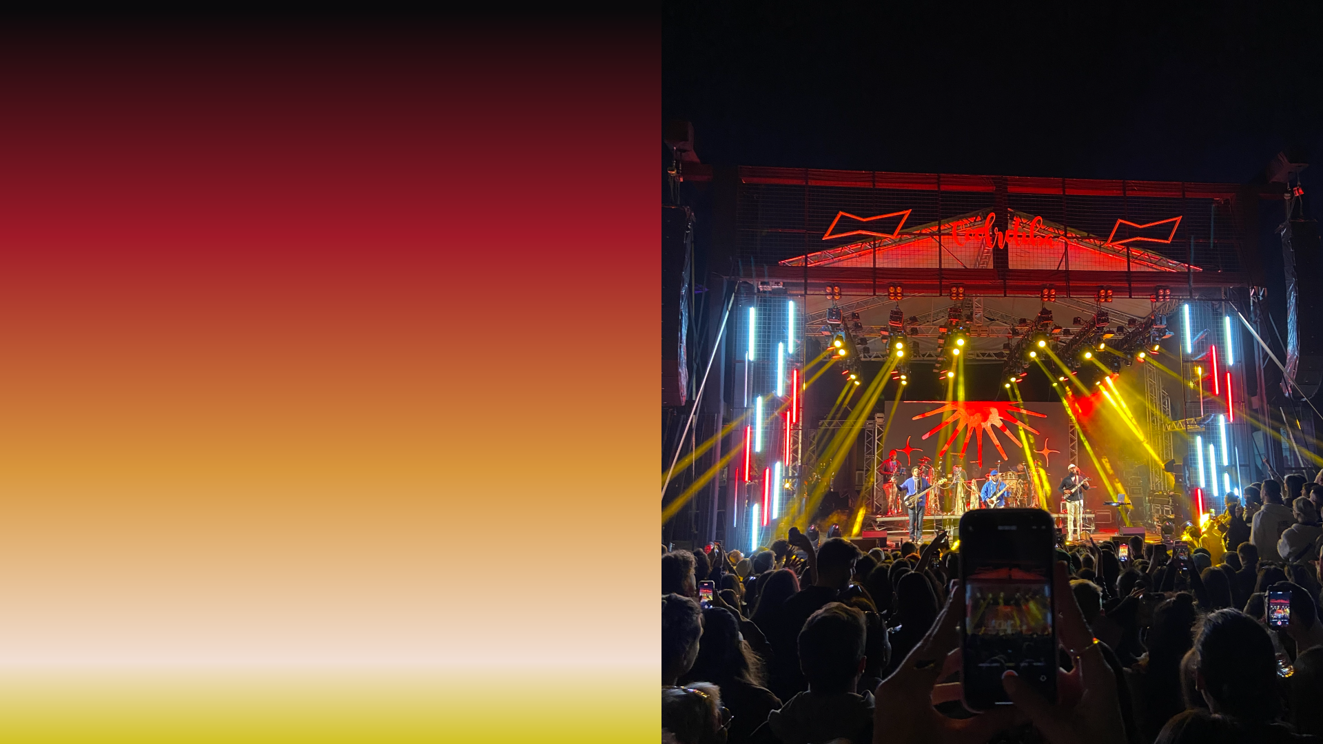
Buscando solucionar o problema, o logo criou-se forma a partir de um lettering, onde o “raio” representa a energia de um dia de festividades, a “estrela” a jovialidade, o “play” a música, e o “T” do nome foi transformado em uma araucária, pela sua semelhança a árvore símbolo da região. A partir do lettering a identidade visual foi desenvolvida, mantendo as cores originais do evento, e trazendo um apelo visual jovem e divertido para suas comunicações. Foi criado também dois degradês que representam o passar de um dia para fortificar o branding de um dia de festividades.
EN
Seeking to solve the problem, the logo was created using lettering, where the “ray” represents the energy of a day of festivities, the “star” represents joy, the ‘play’ represents music, and the “T” in the name was transformed into an araucaria tree, due to its similarity to the region's symbolic tree. Based on the lettering, the visual identity was developed, maintaining the original colors of the event and bringing a youthful and fun visual appeal to its communications. Two gradients were also created to represent the passing of a day to reinforce the branding of a day of festivities.
Obrigado.